
Dozens of decisions, five screens too many
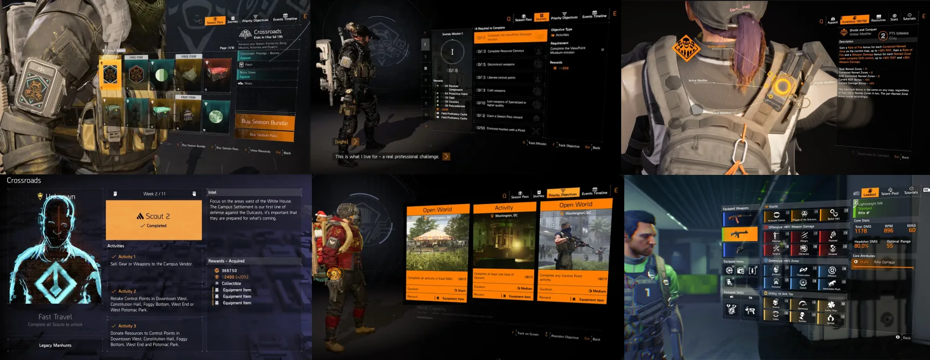
The Division 2 is a complex beast. Deep customization, gear optimization, talent trees, mod systems, seasonal content. The kind of product where players make dozens of meaningful decisions per session.
Here's the problem: some of those decisions took far too long. Core tasks ran 5–6 steps across multiple screens. Players made mistakes and got frustrated, and the same questions kept surfacing in the forums.
Picture a player with twenty minutes before the squad logs on. They want to tweak a weapon and swap a mod before the night starts. Six steps and three screens later they're still menu-diving while the squad sits in queue. The easy call is to skip it and drop in under-prepared.
One skipped optimization is no big deal. Multiply it across a few million players and you get the kind of churn nobody can trace to a single cause.
Power users wanted control, casual players wanted clarity, and both needed the same interface. Not easy. That's the fun part.
Concept to live release, end to end
- Feature-needs analysis and design for more than 15 systems over five years.
- User flows, UI mockups, and interactive prototypes for each of them.
- Tutorial systems: steps, flows, instructional text.
- Shipped end to end, from concept to live release.
Built for the spreadsheet crowd
Our players range from "two hours on a weekend" to "I keep a spreadsheet for my builds." The existing interfaces were built for the spreadsheet crowd. Deep and powerful, and overwhelming for everyone else.
The symptoms were clear. A core optimization task took 5–6 steps across three or more screens. The same questions kept surfacing: "how do I do X?" Errors piled up on the complex tasks. Power users tolerated the friction. Casual players just left.
The personas
We had four core player types from earlier research:
| Persona | How they handle complexity |
|---|---|
| The Master | Loves it. Wants full control, tolerates friction for power. |
| The Pathfinder | Explores everything, needs clear signposting or gets lost. |
| The Teamplayer | Follows the group, needs obvious paths. |
| The Easygoer | Just wants to play. Hates friction, bounces if confused. |
The challenge: serve all four with one interface. No "casual mode" cop-out.
Four rules, no exceptions
After analyzing pain points across dozens of features, I landed on a few rules that became the north star for everything after:
- Three steps or less for any core task. No exceptions.
- Progressive disclosure. Simple first, depth on demand.
- No dead ends. Every screen has a clear "what's next."
- Immediate feedback. The player always knows what happened.
Tinkering on the go: one screen, three steps
The problem. Players wanted to optimize their gear, recalibrate stats, improve equipment. The old way meant navigating to a specific spot in the game world, opening a dedicated workbench, then digging through multiple menus. 5–6 steps. Every time.
The insight. Players don't want "optimization" as a destination. They want to optimize in context: while checking inventory, while prepping for a mission, while comparing items. Right there, right then.
The solution. One screen, every optimization action, reachable from anywhere.
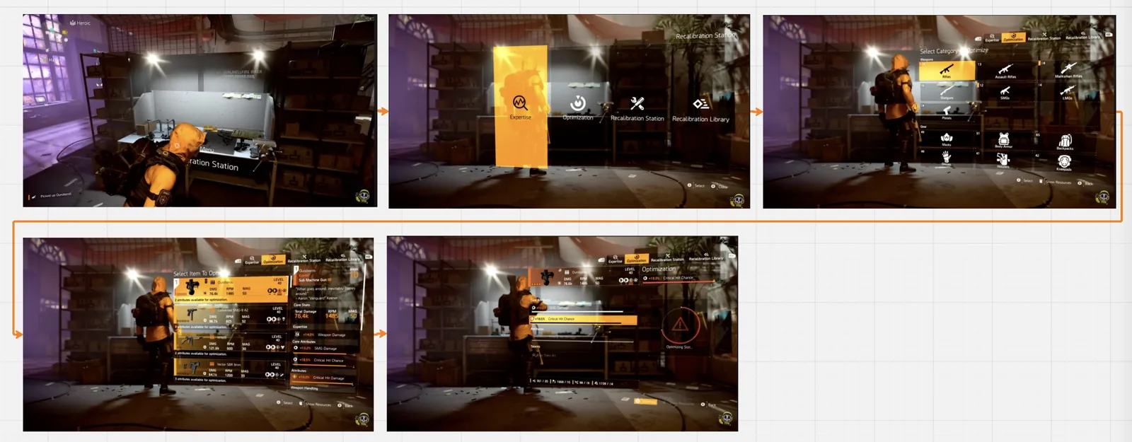
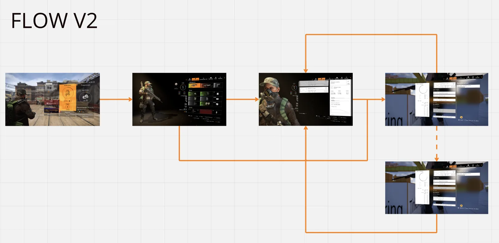
What changed: a single screen for everything, a clear visual hierarchy of what can improve versus what's maxed, contextual access from inventory or loadout or gear inspection, and exactly three steps. Select item, choose optimization, confirm. No location required, no menu diving.
The same method, across the product
| Feature | What got simplified |
|---|---|
| Descent Inventory | Loot management for a whole new game mode |
| ISAC Mod Screen | Mod flow: obtain, verify, equip |
| Seasonal ESC Menu | All seasonal info in one scannable dashboard |
| Descent Talent Selection | Less decision paralysis in build creation |
| Priority Objectives | Daily and weekly goals with a simple refresh |
| Scouts 2.0 | Timeline of completed versus remaining, designed from scratch |
| Store Redesign | VFX and other storefront tabs |
| Descent AR Panel | Fast decisions in the new game mode |
| Seasonal Journey | A complex hierarchy of missions, objectives, and rewards, from scratch |
| User Onboarding | Reworked the first hour, tutorial discovery and timing |
| Companion | Obtain, compare, and control an AI companion, kept as simple as possible |
If the tutorial has to explain the UI, the UI is wrong
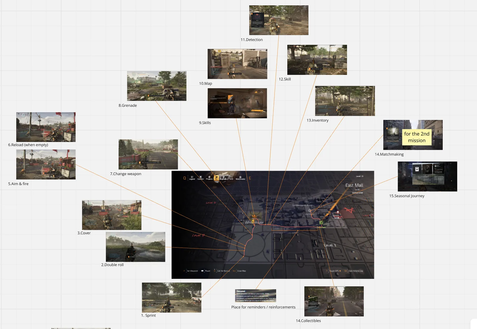
Complex systems need onboarding, but here's my rule: if your tutorial has to explain the UI, your UI is wrong. Tutorials should teach concepts. The interface should be self-evident.
For each feature I designed the tutorial steps and flow, the instructional text (clear, concise, action-oriented), a progressive reveal that teaches as players hit complexity, and a skip option to respect the veterans.
Three steps, ten seconds, still running
| What we measured | Outcome |
|---|---|
| Steps to complete a core task | 5–6 → 3 |
| Task time, experienced player | Under 10 seconds, measured in controlled user testing |
| Systems on one consistent method | 15+ over five years |
| Core durability | Most still in use years later |
| Support questions | Anecdotally minimal; the community answer shifted to "that's easy" |
What held, and what grew
In a live product with millions of players, shipping something that needs immediate fixes is expensive. Patches, hotfixes, forum drama, eroded trust. So the goal was always to get it right the first time.
Most of it held. ISAC Mods, Priority Objectives, Seasonal Journey, the seasonal modifiers all shipped clean and stayed that way. (The seasonal ones partly by nature, since they rotate out at season's end.)
That's the real lesson. Front-load the thinking — needs analysis before design, flows before UI, prototypes before code — and your core holds. When it changes, it changes because the business asked for more, not because you got it wrong.
Community validation
Here's how I know it landed. When players do ask about these features now, the community answer is usually some version of "oh, that's easy, you just..." The knowledge went from tribal to self-evident. That was the goal.
Most of this work is still running, years later, unchanged.
Speed-to-ship means nothing if you ship twice. The durable core is the real metric — and it's the reason the upfront investment in flows, prototypes, and documentation keeps paying for itself.
Three things that stuck
Simplicity is achieved, not started with.
Every feature began complex. Simplicity came from iteration: I cut steps and consolidated screens, questioning every element that was left. K.I.S.S. is easy to say and brutal to execute.
Design for the extremes, win the middle.
If it works for The Master and The Easygoer, it works for everyone. Progressive disclosure is the cheat code: simple by default, depth on demand.
The durable core is the real metric.
Speed-to-ship means nothing if you ship twice. The upfront investment in flows, prototypes, and documentation pays for itself, and it's the reason most of this work is still running years later.
This isn't really about games
I know "video game UX" can sound niche. It isn't.
| Enterprise challenge | Same problem, different context |
|---|---|
| Banking dashboards | Complex financial data, scannable decisions |
| Insurance policy tools | Multi-step applications, streamlined flows |
| Enterprise software | Feature-rich products, progressive disclosure |
| Any decision-support UI | Reduce cognitive load without removing power |
The method transfers, because complexity is complexity and players are users.
Simpler without dumbing it down. That's the job whether the screen lives in a shooter or a bank.