
A strong money-maker that quietly underperformed
The Division 2 launched in 2019 as a "one and done" online game. The Warlords of New York DLC changed that, turning it into a live service, earning after the initial purchase two ways: cosmetics in the in-game Store, and a Season Pass players bought and then chased to completion.
On paper the Season Pass sat right next to the Store as a strong money-maker. In practice it underperformed. Not failing, just quietly leaving real money on the table.
With 2 million active players, "quietly" adds up fast.
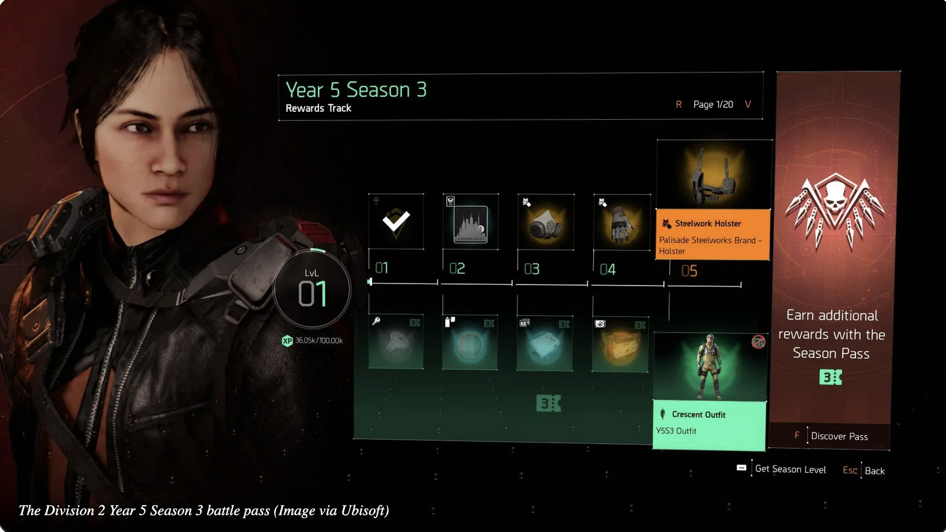
Three problems, and they compounded
The old pass had three problems, and they stacked on top of each other.
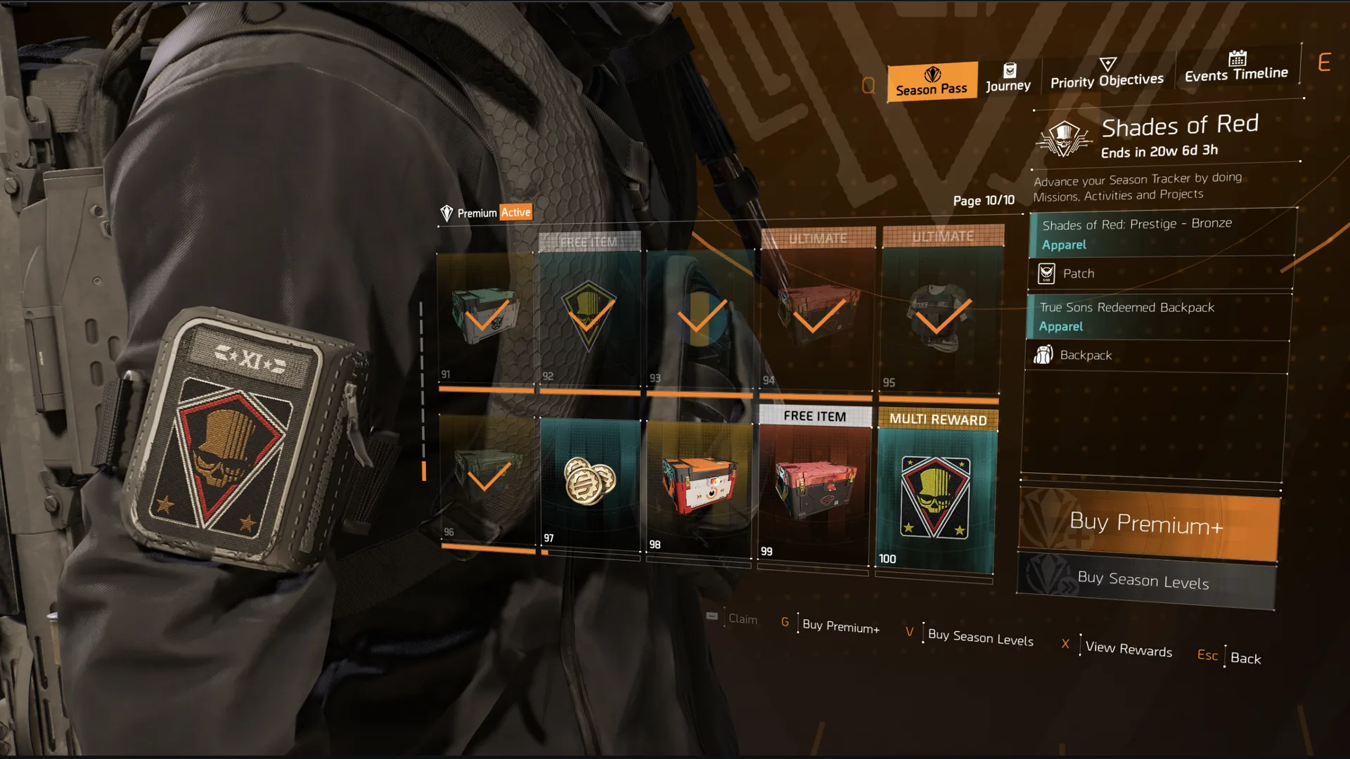
- Poor visual presentation. Rewards shown as tiny thumbnails : small text, no descriptions, no flavour. A player couldn't tell at a glance what they were working toward, or why they should care. Low clarity, low desire.
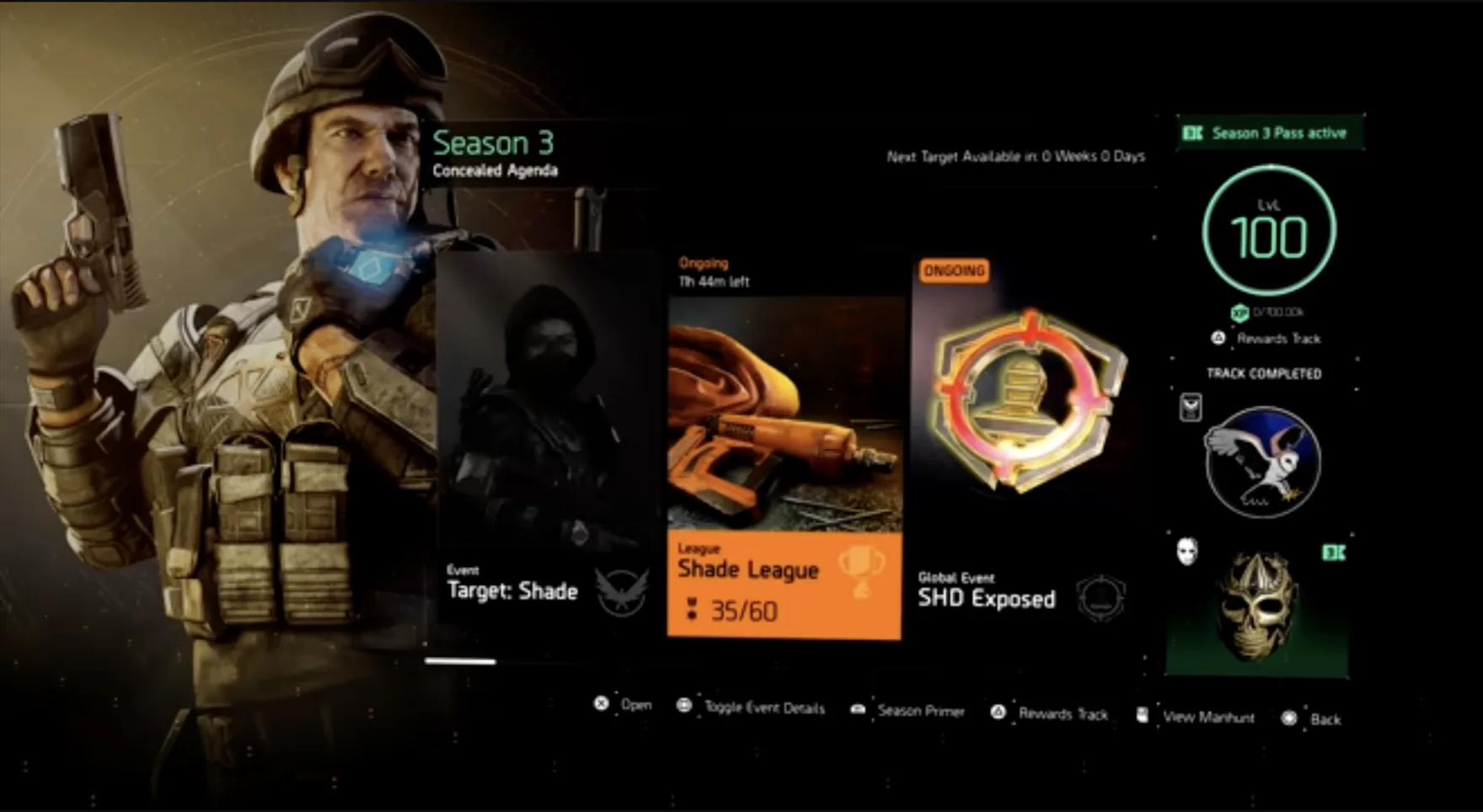
- Buried in the menus. The pass lived in a corner of a busy season screen, reached through an easy-to-miss "Rewards track" option. The thing meant to drive spend wasn't in the player's natural path.
- Gated behind roughly 40 hours. It only unlocked for players who'd bought the DLC, finished it, and reached level 40. The revenue moment sat behind a wall most of the base never reached.
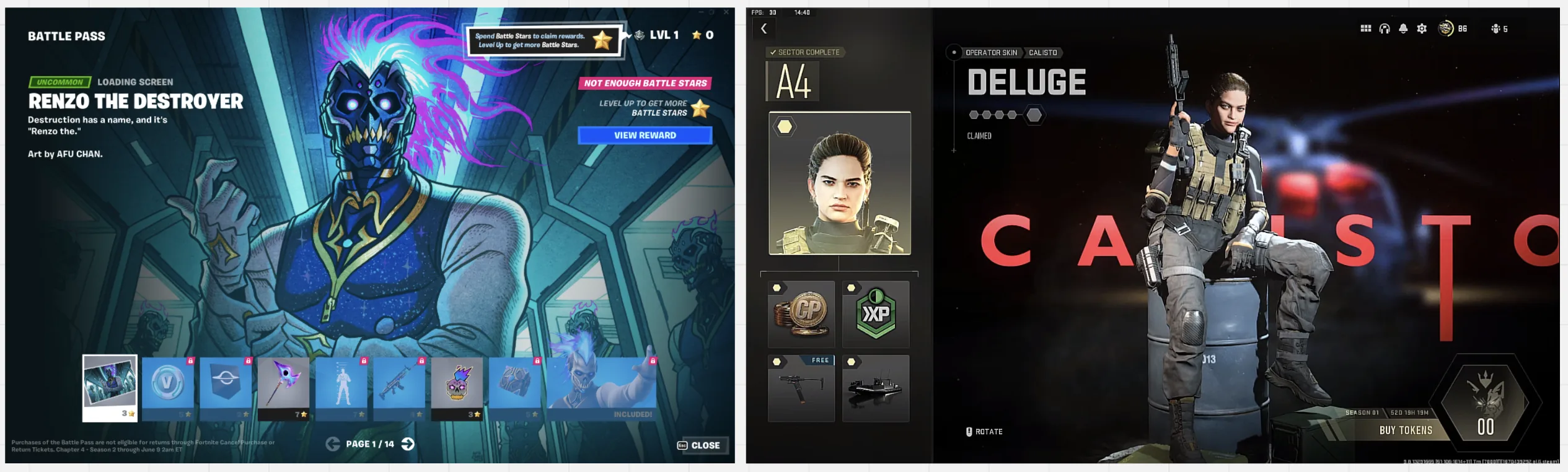
Then the competitive gap made all three worse. Fortnite and Call of Duty were showing their battle-pass rewards big, bold, and desirable, using presentation to sell the pass before a player spent a cent.
No brief, no vision, so we built the direction ourselves
Normally a brief lands with clear constraints and a vision, but this time neither came. So the Game Designer owning the broader Seasons 2.0 overhaul and I started from a blank page and built the direction ourselves.
- Owned the Season Pass UX end to end : research, methodology, hypotheses, competitive analysis, ideation, design, interactive mockups, and iteration
- Designed three conversion concepts, tested them, and drove to a shippable spec
- Aligned with UI and Gameplay Programming on what the existing tech could actually support
- Extended the method afterward to Store tabs, DLC launches, and seasonal events
Solo UX, partnered with the Seasons 2.0 Game Designer, plus UI, Gameplay Programming, and Monetization.
Let players choose their own path
The Seasons 2.0 designer had a vision. Instead of a flat linear grind through 100 levels, players would choose their own route through the rewards, picking a path that suited them. The reference points were strong: Call of Duty's hex map, Rainbow Six Siege's branching tree, DOTA's Cavern Crawl.
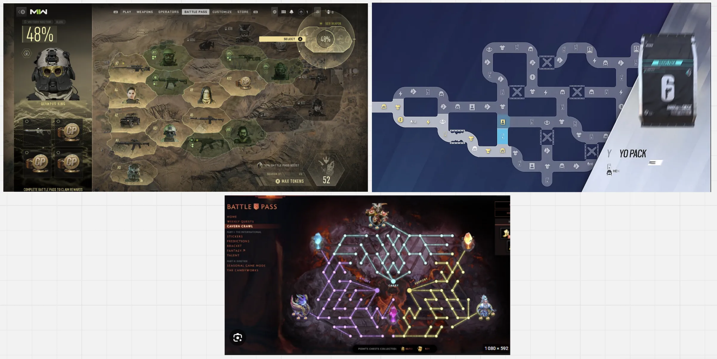
The upside was real:
- Player agency. Freedom to chase your own goals is a strong intrinsic motivator.
- Flexibility. New branches could be added for special or limited-time events.
- Scalability. Reward counts could be tuned each season to shape desirability and playtime.
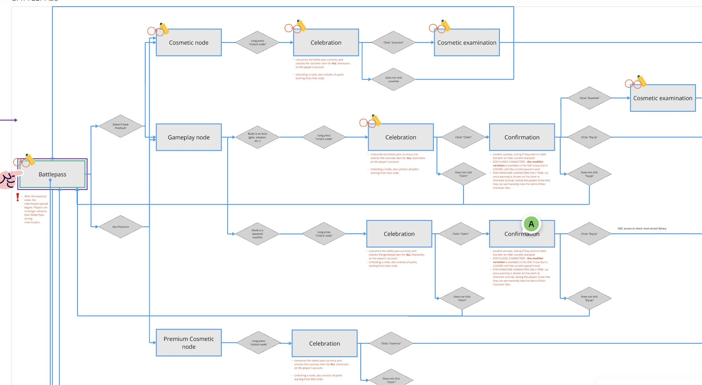
I started by mapping the main flows, work out what the feature actually needed, which screens to mock up, and how it would slot into the wider Seasons 2.0 system.
Everything had to fit inside a fixed grid
The game's technical infrastructure and UI weren't built for that kind of flexibility.
The core constraint was blunt: everything had to fit inside a fixed grid.
That killed the branching-map dream. A free-form path couldn't live on this grid without a rework nobody had time or budget for. So the question changed. Not "how do we build the fancy thing," but "how do we fix all three original problems inside the grid we already have?"
The grid gave me the shape
I used it to solve findability and access outright, and to make the reward tiles finally readable:
- Scrollable pages, maximum 10 items each. Dense enough to feel rich, sparse enough to breathe.
- Big item tiles with a live preview on the player model. You see the reward, on your character, at a glance : the single biggest fix for the "I can't tell what I'm getting" problem.
- The pass surfaced from level 1, two steps away, in its own dedicated menu. No more 40-hour wall, no more hunting.
Findability and access were solved by placement. That left the hardest problem: making the rewards actually feel worth buying.
Three answers to the value question
So I designed three different answers, then argued them to the ground with the team.
- Concept A · Value Stack. Lead with total value, single tier, clear price. Message: "Here's what you're missing."
- Concept B · Progress Preview. Show the journey, not just the destination but a visual timeline of rewards. Message: "Look how far you'll go."
- Concept C · Instant Gratification. Lead with immediate unlocks. Message: "Value starts right now."

Players wanted both, so the winner was a hybrid
We evaluated through stakeholder review, flow walkthroughs, and prototype testing, with rounds of user research along the way.
The winner was a hybrid then : Value Stack clarity plus Progress Preview visualization. Players wanted both: to know exactly what they're getting, and to see the road ahead.
What changed in the final design:
- Value clarity above the fold. Total rewards visible immediately, one primary CTA, no competing buttons.
- A visual progress system. Clear tier visualization, current position always in view, rewards tagged as the carrot.
- Fewer purchase steps. Cut the unnecessary confirmation screens, added immediate success feedback.
- Post-purchase momentum. Something unlocks right away, with clear "what's next" guidance and small celebration moments.
One method, applied across the product
It worked, so we applied it across the product.
| Touchpoint | What I designed |
|---|---|
| VFX Store Tab | New storefront, clear categories, streamlined purchase |
| Halloween Event | Event cache purchase and opening flow |
| Winter Event | Community event with purchase integration |
| DLC launch | Full purchase funnel and onboarding |
| Bundle strategy | Redesigned bundle presentation and placement |
Five rules every purchase touchpoint now follows
- Show value before asking for money. The player understands what they get first.
- One primary action per screen. No competing CTAs.
- Progress over possession. Show what they'll achieve, not just what they'll own.
- Immediate reward. Something unlocks now.
- Clear exit and return. Never let them feel trapped.
From laggard to a top-5 revenue performer
| What we measured | Before | After |
|---|---|---|
| Completion rate | 45% | 50%+ (from monetization data) |
| Revenue ranking | Lagging the portfolio | Top-5 across Ubisoft live services, #2 at points |
| Purchase flow | Multiple friction points | Streamlined |
| Design reuse | One-off designs | Template for every season since |
 Old
Redesign
Old
Redesign
Why completion rate matters
45% to 50% doesn't sound dramatic. Here's why it is. At 2M+ active players, five percentage points is tens of thousands more completed subscriptions. A completed subscription means a player who actually engaged, which means better retention, which means higher lifetime value. Completion is the quiet metric. Anyone can sell a subscription — the real question is whether players get value from it.
The revenue story
The Season Pass went from a laggard to one of the top revenue performers across Ubisoft's live services. From the monetization data I saw, and confirmed with the monetization team, it sat in the top five and at points reached #2, behind Rainbow Six Siege, a far bigger title.
The long-term win is reuse. The redesigned approach became the default "this is how we do Season Pass now." Every season since follows the patterns from this work, so the upfront investment keeps paying off.
A completed subscription is a player who got value. That's the number I'd defend.
Anyone can sell a subscription with a dark pattern. Creating subscribers who actually engage (and finish) is the real work. Completion went up, the pass became a top-5 earner, and the design became the template for every season since.
Three things that stuck
Conversion is a journey, not a moment.
The purchase button is one step. Real conversion happens across awareness, understanding, decision, purchase, engagement, and completion. Design for all of it.
Completion beats conversion.
Selling subscriptions is easy with dark patterns. Creating subscribers who actually engage is the real work and it's the metric I'd defend over any top-of-funnel number.
Constraints sharpen the work.
The grid killed the ambitious version and forced the pragmatic one. The pragmatic one shipped, solved all three problems, and became the template. A constraint you design with beats a dream you can't build.
This isn't really about games
The method transfers because friction is friction and money is money, whatever the screen says on top. Complex products that need a clear value proposition. Premium-account funnels. Onboarding that drives completion, not just signups. Checkout flows fighting abandonment.
| Enterprise challenge | Same problem, different context |
|---|---|
| Insurance policy purchase | Complex product, needs a clear value proposition |
| Banking product upgrades | Premium-account conversion funnels |
| Subscription services | Onboarding that drives completion |
| E-commerce checkout | Reducing abandonment, lifting order value |
And the constraint story transfers too. Every mature product team has a system they can't casually rebuild. The skill is making the win happen inside it.
Make the value obvious, cut the friction, and prove the win inside the system you've already got.