
A bank built on proximity, with its digital front door shut
Caisse d'Épargne d'Aubonne is a small Swiss regional bank with a simple promise: stay close to people, give them what they actually need. Students, seniors, families, professionals, entrepreneurs. Good people with solid values.
In 2020, the website wasn't living up to that promise. It looked dated, it didn't sound like them, and it did almost nothing for them. The bank ran on offline relationships. If you wanted to open an account, you called or walked in. There was no way to start anything online at all. For a bank whose whole identity is proximity, the digital front door was shut.
Picture an entrepreneur ready to commit on a Sunday night. Or a daughter trying to set up an account for her aging mother, somewhere between work and the school run. The promise was "close to you", but in reality office hours ran the show.
And so, my job was to open it, 24/7.
Solo designer, working directly with the directors
- Ran the full UX process, start to finish
- Did the stakeholder interviews and the user research
- Designed and tested three concepts
- Delivered the final design and guided implementation
One designer, in the room with the bank's directors and staff for seven months.
Winning over skeptical stakeholders
Here's the thing about UX research in a traditional environment: not everyone's sold on it.
During my interviews with the staff and stakeholders, more than once I heard a version of this:
Fair enough and I do get it: it is unusual, it disturbs. It seems so out of place. So I bought trust with transparency. Monthly presentations where I walked the directors through the work and the reasoning behind it: what we'd learned, what was next, what it meant for the design.
Seeing the progress and the method, they understood and came around. Transparency is incredible.
User research
The bank serves five very different kinds of people, and a senior doesn't use a banking site anything like an entrepreneur does. So I had to understand each of them on their own terms:
- How do they relate to managing money?
- What would actually make their daily life easier?
- What earns their trust in a bank?
- Where do they get stuck?
Competitive analysis
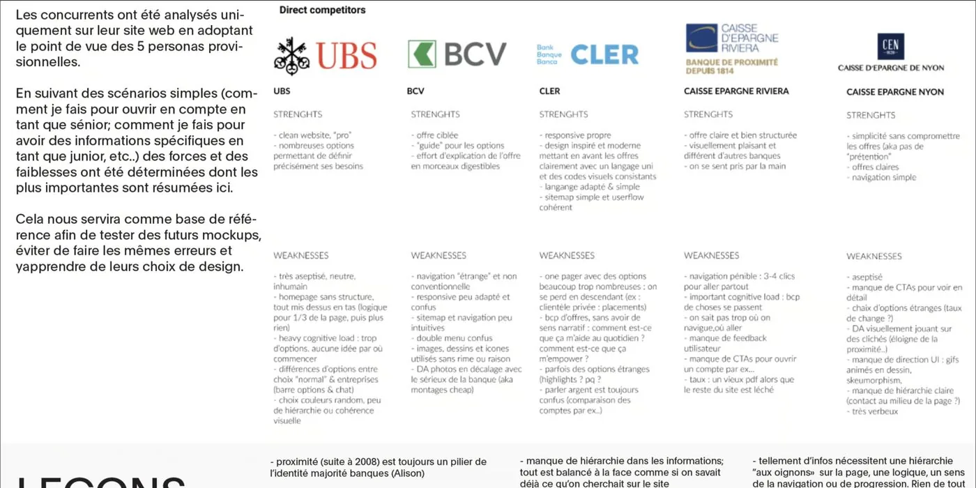
I ran simple scenarios through UBS, BCV, CLER, and other regional banks. "Open an account as a senior." "Find the business services." Here's what each got right and wrong:
| Bank | What works | What doesn't |
|---|---|---|
| UBS | Clean, professional | Feels impersonal, complex navigation |
| BCV | Good options guide | Confusing layout |
| CLER | Modern, responsive | Cluttered, too many options |
| Caisse Épargne Riviera | Clear, pleasant | 3–4 clicks to reach anything |
| Caisse Épargne Nyon | Simple offers | Dated, not enough CTAs |
The users
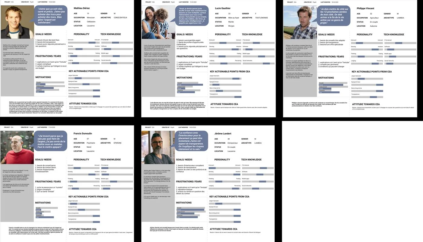
From the research and 15+ interviews, five personas emerged:
| Persona | What they need |
|---|---|
| Students | Flexibility, clarity, simplicity, transparency |
| Families | Reassurance, guidance, feeling understood |
| Seniors | Help with wealth transmission, simple and trustworthy |
| Professionals | Quick access, efficiency, no fluff |
| Entrepreneurs | Business services, growth support, flexibility |
Three concepts, tested
I designed three different directions and put them in front of real users: light prototyping, online interviews, and in-person sessions once COVID rules eased.
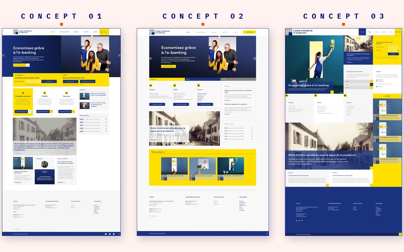
What testing made obvious:
- People need fast access to urgent things (block a card, solution when e-banking is down)
- Organize services by need, not by product category
- Keep contact visible everywhere. Proximity is the whole brand.
- Plain language. Not everyone speaks "bank."
Before and after
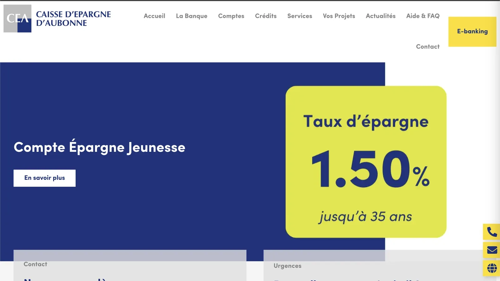
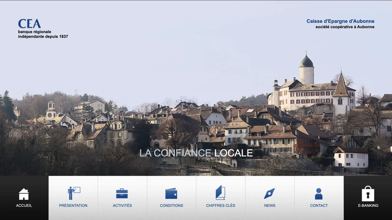
The site I replaced and the site I shipped, side by side. Same bank, same promise but the new version actively enforces it.
 Before
After
Before
After
The homepage
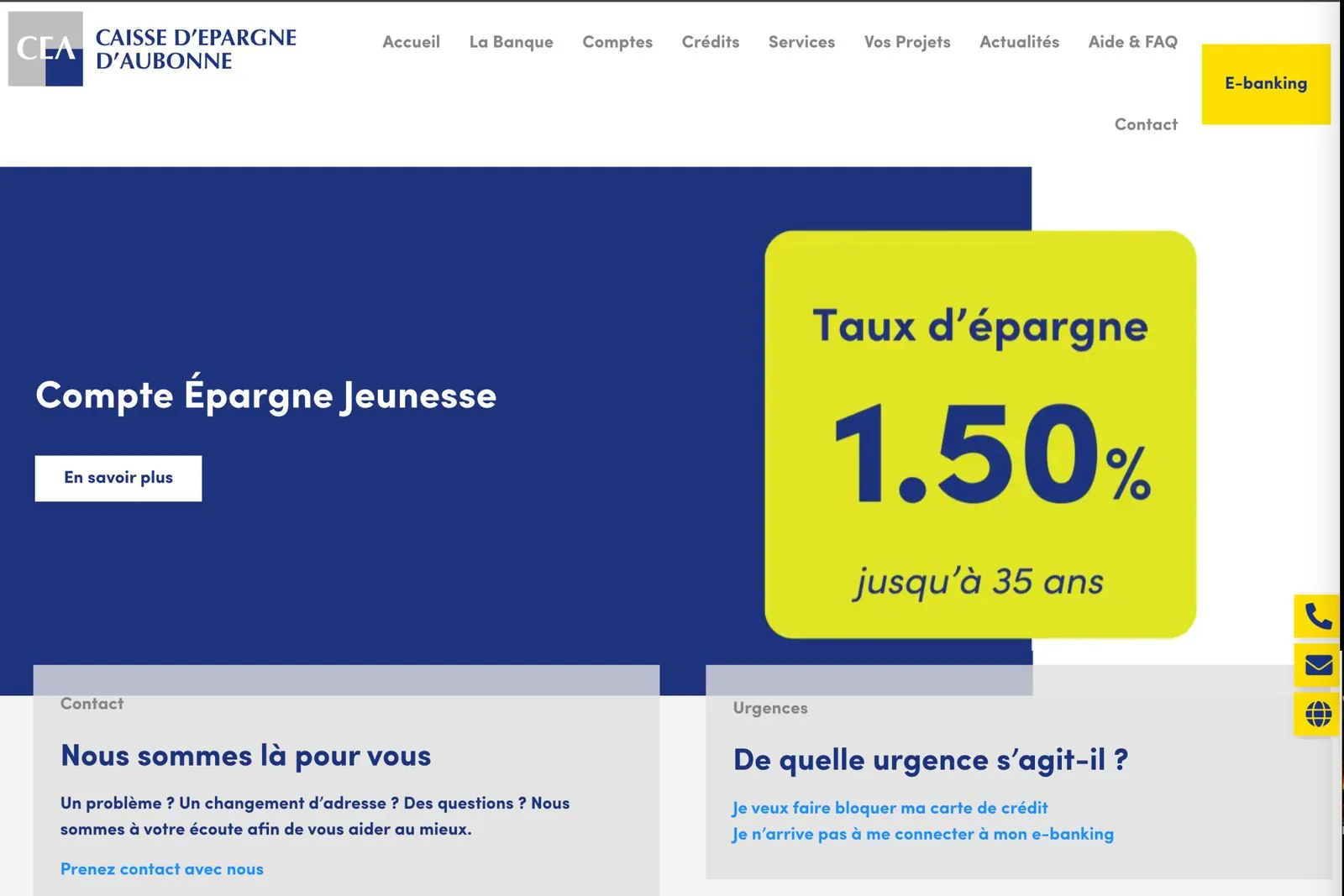
Everything that matters, right there. No hunting. News in the header, contact one click away, emergency services up front, and a contact panel that stays visible as you scroll. The page works as a direct line to the bank, which is exactly how they want to feel to a customer.
Shown full-width at the top of this page : every option marked, contact and emergencies addressed directly.
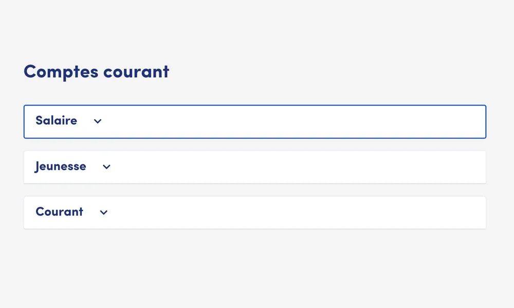
The accounts page: the new front door
This was the heart of it. For the first time, a customer could browse every account type in plain language and open one online. No phone call, no branch visit.
One senior in testing told me she'd never opened anything online and was afraid she'd "do it wrong." So the flow was built to forgive: every step reversible, every action confirmed before it counts. Her fear set the bar for the whole page.
Each option expands into a clear description, with the "open an account" action always in reach.
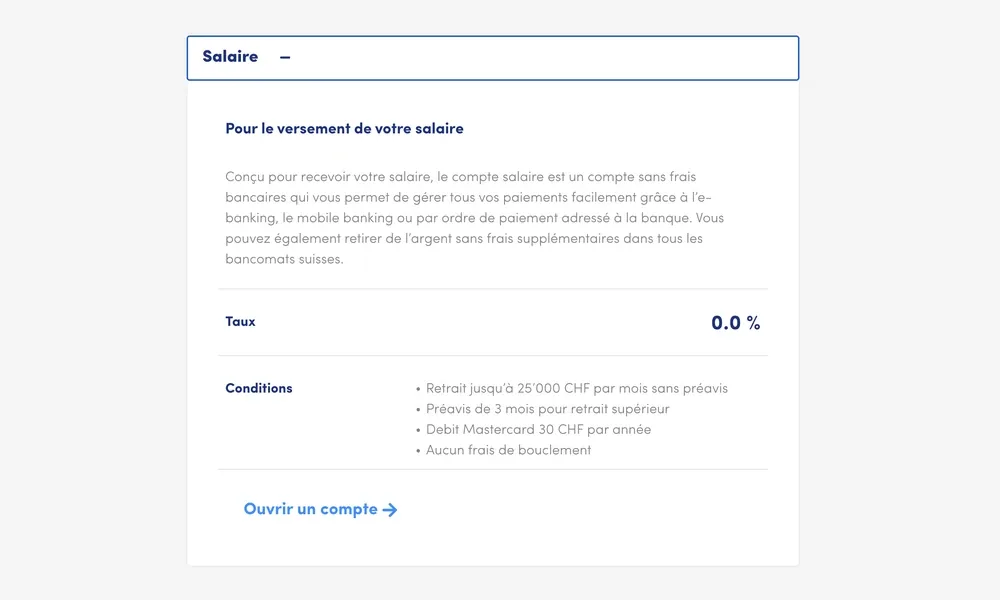
This is the capability the bank never had before.
A front door that's still open six years later
| What happened | Detail |
|---|---|
| First online account opening | Shipped the bank's first-ever online flow. Before this, every account started by phone or in branch. |
| Account-opening interest | By the bank's own account, requests rose from a couple a month to a dozen or more. |
| Design longevity | Still live and near-unchanged at ceanet.ch, six years on. |
| Stakeholder buy-in | The people who called it "wasted time" became champions of the process. |
Still the bank's front door, six years on.
Same design I shipped in 2020, near-untouched, still doing the job. Go see it in the wild :).
ceanet.ch ↗Three things that stuck
Stakeholder management is design work.
The interviews and the analysis felt like "extra" to the directors at first. Monthly presentations turned that around. Keeping people in the loop isn't separate from the design, it is the design.
Simple is brutal.
K.I.S.S. is easy to say and punishing to execute. Every element on the final site had to earn its place or get cut.
One solution, very different users.
A family and a senior want different things, but both want clarity and both want trust. The site had to serve all five personas without splintering into five sites.