
A build system deep enough to break the game, if you could use it easily
Rise Up handed players a new toy: seasonal modifiers they could stack and manipulate to break the game. Deep, powerful, and order-dependent: the sequence you stacked them in changed the result. Three module types, synergies that only fired in the right combination and stack counts that compounded.
For theorycrafters and everyone else, it should be a playground, but if unusable or clunky, it could be a potential wall.
Picture the player opening the modifier screen, finding a stack of order-dependent modules they can't parse. Of course they back out to run whatever the game already suggested, never touching this feature. If the depth is right there, but poorly understood it is useless.
So the risk was simple: to build a system nobody understands is to build a system nobody touches. My job was to make the depth feel fun, usable and understood by all.
And of course I wasn't working on a blank canvas. This had to live inside The Division 2's existing design system, on a screen that's already busy, read in seconds no matter the platform.
From paper flow to shippable spec
- Owned the UX for the modifier system, end to end
- Worked within The Division 2's design system, applying its rules to a complex new feature
- Vibecoded the interactive prototype and ran the cross-functional alignment sessions on it
- Took it from paper flow to a validated, shippable spec
Solo UX on the feature, working with Game Design, UI, and Gameplay Programming.
Making a new feature feel like it had always been there
Here's the thing about designing for a live AAA game: you don't get to reinvent the interface every season (thank God!). Consistency is the product. Players have years of muscle memory. Break the patterns and you don't look bold, you look broken.
I didn't build The Division 2's design system, so my job was harder in a quieter way: take a brand-new, genuinely complex feature and make it feel like it had always been there.
That system sets real rules:
- A type scale running from 50pt headers down to 17pt HUD numbers, each with a fixed weight. New content means finding the right existing style, not inventing a font size.
- A 4px adaptive grid: 144px columns, 16px gutters, a 1728px content frame that flexes between 2D and 3D menu layouts.
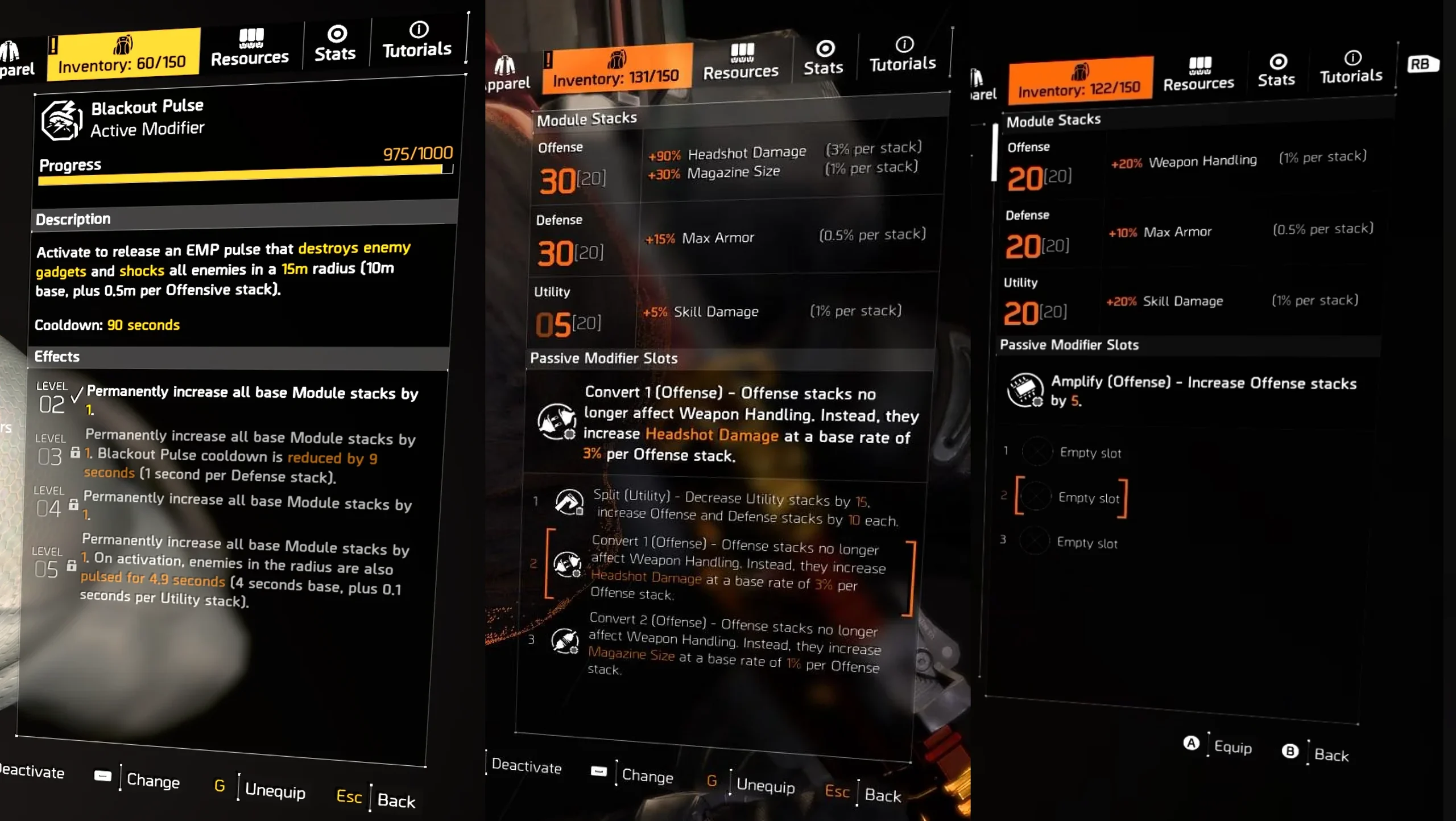
My work was reusing all of it well: what info was useful, where, how much. I needed to show the stacks to be manipulated, but also experience bars, information about the combinations for the players to have an overview, showing clearly the base and the increases from it. The info panels built on the grid held firm and even on an info dense screen stayed readable. The new components reused the system's existing pieces so this brand-new feature met the same standard as everything around it. Again and again cognitive load is relieved by reusing the same vocabulary in a different way.
The hard part
Funnily enough it wasn't designing the screen (if good research is done, that usually never is). It was proving the interaction was understandable before anyone wrote a line of code.
Order-dependent stacking is the kind of thing that looks fine in a static mockup and falls apart the second a real person tries to reason about it. Does slotting this mod first matter? What does the synergy do? Why did my numbers change? You can't answer that with a flat image. You need something people can poke at.
An AI-prototyped interaction, not an AI-designed one
So I built something people could poke at. In the past I would spend hours and days designing all the screens for an interactive proto on Figma, never quite breaking the illusion. But here, having vibecoded a working, interactive prototype of the stacking system, a real, clickable model where you could drop modifiers into the pipeline, reorder them, and watch the synergies and stat changes resolve live, just made it so unbelievably simple to know that the real feature would be fun.
After thorough testing, I put it in front of the people who decide whether a feature ships: Game Design, UI, Gameplay Programming. Short, unplanned, 15-minute sessions. They'd play with the prototype themselves, ask questions, and I'd answer them on the spot, in the thing, instead of in a 20-slide deck a week later.
That changed the game. Literally.
- It killed an estimated 2–3 weeks of traditional interactive-prototype work.
- It absorbed roughly 4 hours of alignment meetings into a tool people could just try.
And the best part: That time, we did not have it. The prototype carried the conversation and validated the interaction model. I handed engineering a spec that was already pressure-tested. The shipped version traded some of the prototype's flourish for time and UI constraints, but the core flow that survived was the one people had already played with and understood.
The chatter was about combos, not UI clunkiness or menu complexity
The honest signal first: when the season launched, the chatter wasn't "this is too confusing." It was players trading combinations and theorycrafting the limits. No wave of complaints about the system being hard to understand but excitement about what you could do with it. For a feature whose whole risk was comprehension, that's the result that matters in the end.
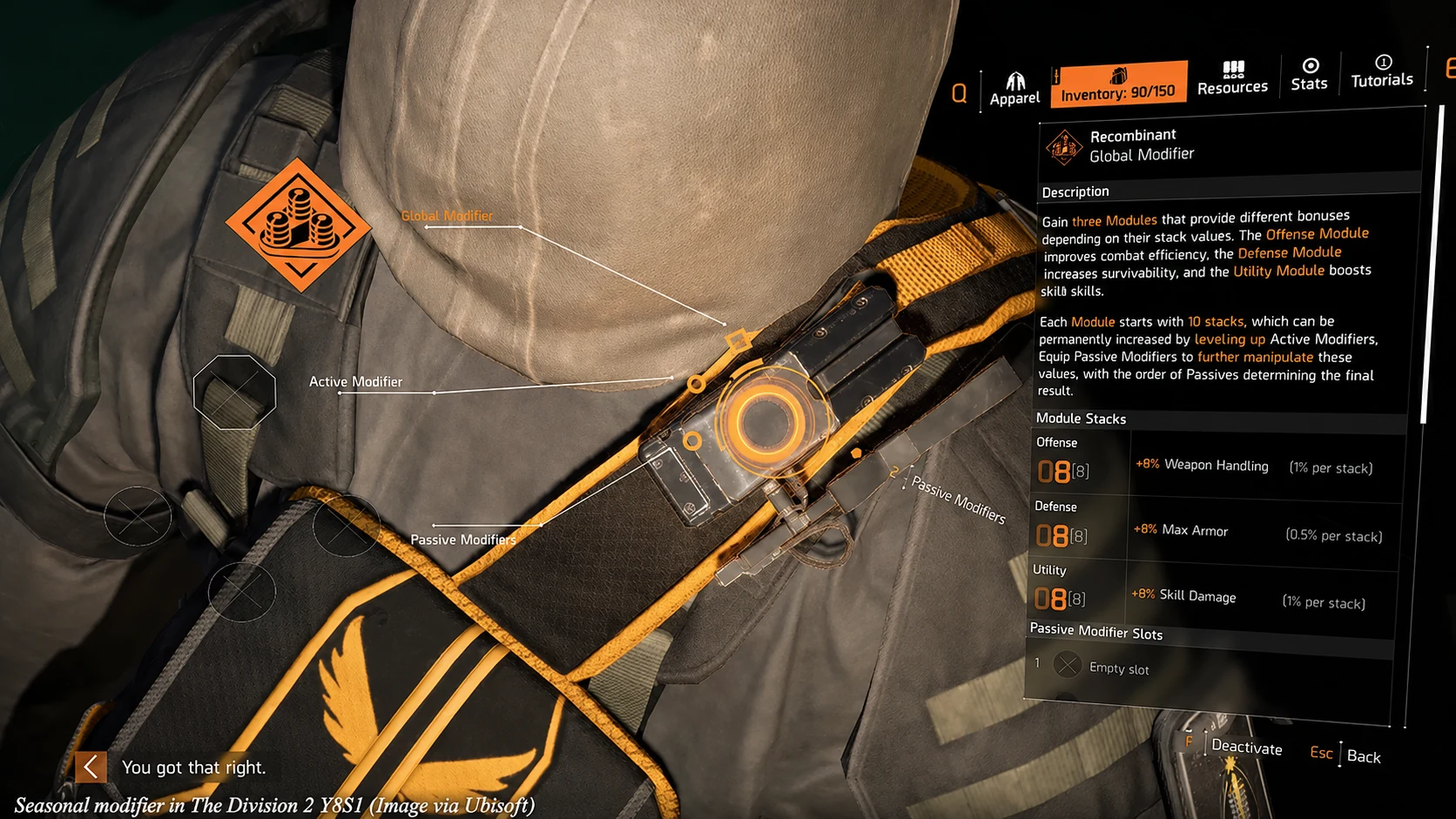
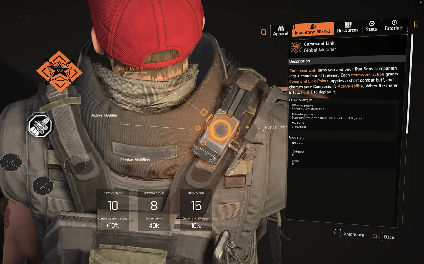 Mid-fi
Shipped
Mid-fi
Shipped
Engagement was up. I'll put a conservative number on it: at least +10%.
Creators ran with it too: full breakdown videos, "best combos," cheat sheets. The depth gave the community something to chew on, which is exactly what a seasonal system is supposed to do.
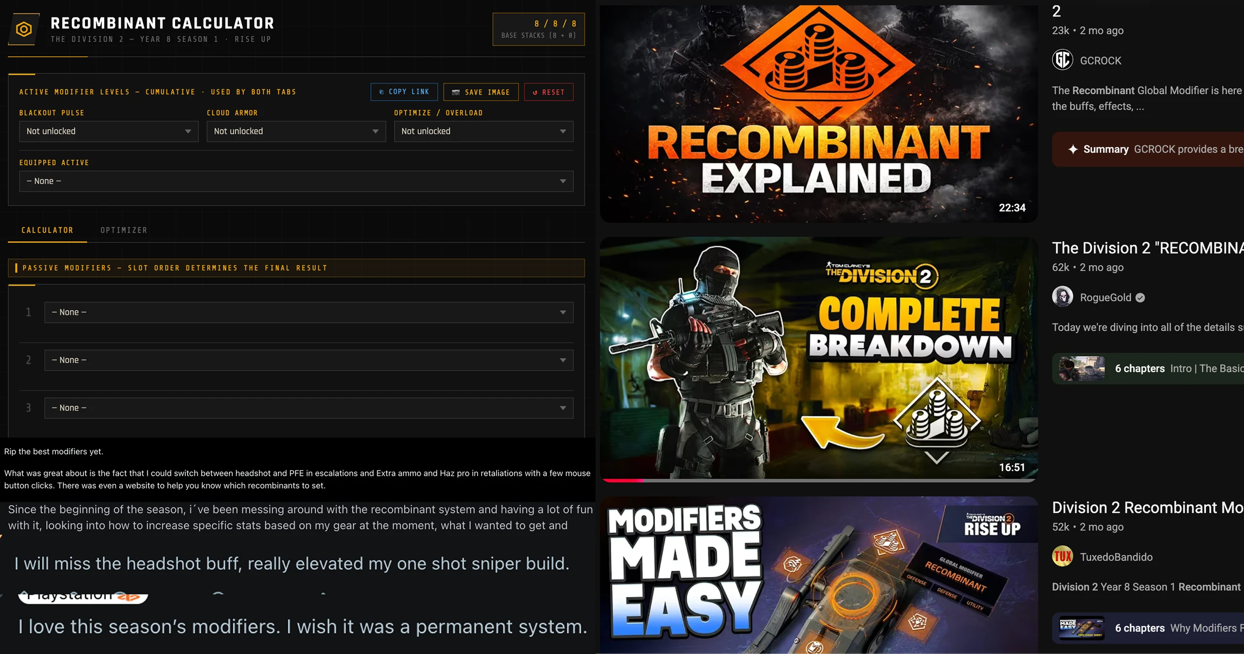
The risk was comprehension. The community answered with fun, joy and devilish combos.
A build system nobody understands is a build system nobody touches (repeating myself, again, I know :). This one, they touched, then with it broke the game on purpose, on camera, and turned into cheat sheets and dreams of power. Fun as fun can be.
Three things that stuck
AI is a prototyping accelerator, not a designer.
Used right, it compresses the slowest part of the job: getting from concept to a testable artifact. The actual design thinking gets more room, not less.
A good system makes complexity feel like depth.
The modifiers were always going to be complicated. The win wasn't hiding that. It was structuring it so players felt smart instead of lost.
Shipping inside a system is its own craft.
The most invisible work is the quiet stuff: reusing the system's existing components, building on the same grid as everything else. That's what made a complex new feature feel native on day one.
Two things here aren't about games at all
The first is working inside a design system instead of around it. Every product team with a mature system has the same quiet fear when they hire: will this person respect what we've built, or repaint it? I spent a season proving a brand-new, complex feature can feel native inside a system I didn't author. That's the answer to that fear.
The second is using AI to collapse the distance between an idea and something people can hold. Weeks of prototyping into an afternoon, then real validation before a line of production code. That isn't a gaming trick. It's how I'd de-risk any complex interface, in any industry.
Make the depth feel like depth, not noise. The screen can be a modifier stack or a banking dashboard but the needs do not change.